Sometimes you have to take two steps back in order to take a giant leap forward.
This became the unofficial motto for the recent maintenance project our dev team took on here in Ordoro Land. Over the past six weeks, we tackled everything from database upgrades to refactoring our CSS in an effort to lay a better foundation for building features in the future.
As our company’s UI Designer, I was responsible for refactoring all things involved with the front-end of our application: CSS, HTML, graphics, fonts, etc. Many of the upgrades I made aren’t new concepts to the Web design world. In fact, many of these practices have been around for years. The important thing is that all of them were taken on in one fell swoop, transforming a piecemeal (yet functional) app, to something cutting edge, both from an end-user and behind-the-scenes point of view.
This type of project is definitely lacking in the glory department and can be downright soul crushing at times, but I couldn’t be prouder of the state of our web app than the one it’s in now. It felt awesome releasing it into the wild last week and here are the steps that were taken to get it there.
1. Did an audit of our entire front-end codebase
Making a thorough list of all of the files that will need to be addressed is a critical starting point for any refactor. Not only do you get a visual representation of the scope of the project, but you can also start prioritizing and organizing by the level of difficulty of certain areas. Furthermore, you force yourself to get reacquainted with all of your source files, helping to reinforce your understanding of how everything works (which developers will love you for, by the way).
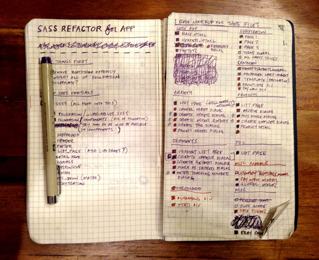
I chose to kick it analog and made the list in my trusty grid notebook. Over 35 html template files needed to be revamped. Those with an asterisk next to them denote a higher level of difficulty than those without. When I’d hit a wall with a beast of a section (like our manual order creation modal), I’d switch to some easier modules to keep the momentum going. It’s all about the small victories with a refactor like this and while this sounds like common sense, using this list as a guide kept me sane throughout the entire project.
2. Refactored our CSS to Sass
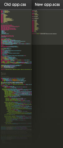
Our previous stylesheet setup was a single file with a half-assed Bootstrap inheritance, a bunch of homegrown CSS and a very rudimentary sense of organization. When we’d build a new feature, I’d tack on the next bunch of selectors to the bottom of the file and we’d go from there. We’re a small team, so that behavior wasn’t the end of the world, but it definitely wasn’t scalable for any grandiose future endeavors. Furthermore, many of my selectors weren’t reusable or object-oriented, but instead very specific to the particular module or page they were to style. This meant a lot of repeated properties to style the same thing in a different context. Yikes.
I decided to move everything over to the loving embrace of the (aptly-named) front-end framework Foundation. I had a lot of success using it for a recent redesign of our marketing site and felt it would be a wise move for our app as well. Foundation was created by the folks at Zurb, has Sass built-in and allows you to add any Sass mixin library of your choosing (we used Compass) to help make things even more efficient.
One of the biggest time savers of moving to Foundation was harnessing the power of its object-oriented grid and layout styles. This sort of thing has been around for ages, but our previous CSS was such a hodgepodge of cruft that no consistent grid was ever truly set up, let alone followed. Our app definitely looked okay, but styling layouts for new feature modules could be quite tedious. This was the most involved portion of the refactor as I pretty much rewrote all of our layout classes to align with Foundation. Elements with very specific classes like “vital_stats orders_stats left clearfix” were replaced with generic, reusable loveliness like “large-6 columns.” Not only do these object-oriented classes make our layout’s grid more consistent, but they also have built-in responsive hooks (courtesy of Foundation) as well. We’ll get into that fun stuff in a bit.
One final thing I’d like to note about converting to Sass is how nicely organized our working files are now also. Instead of the gargantuan 2033-line working file from before, our new one is a slim and trim 35 line file consisting of just the import links to all of the modular Sass partials. This makes it much easier to figure out what’s overriding what and encourages us to use specific classes only when absolutely necessary.
3. Optimized the UI for small and large screens
More than a year before this refactor, I started jonesing to make our 1000px fixed-width app responsive. While very few of our users access the Ordoro app via mobile devices (it makes sense – it’s kinda hard to print shipping labels from an iphone), more than 60% of them use the app on their computer with screen resolutions of 1440px x 900px or higher. Since they’re in the majority, we focused on optimizing for large screens by using trusty ol’ media queries. After hitting a breakpoint of 1380px, the overall layout container becomes fluid and the overall font size increases slightly. All of the inner layout containers’ widths are set in percentages and our typography in ems (another perk of Foundation), so being able to make global changes at different breakpoints was a breeze.
Although we mainly focused on larger screens, we did pull off some pretty fancy stuff for devices with smaller resolution as well. Our app looked pretty gnarly before on mobile devices (something we could live with based on the aforementioned screen-size breakdown of our users), but since were already putting in the effort to responsify things, we figured we might as well make things look passable across the board. Reducing the utility and main navigation links to just icons was one way of doing this, but the most important thing we did was change the layout of our data tables.
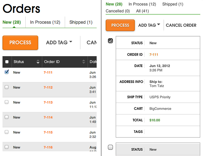
The tables in our app are full of data and functionality and we didn’t want to dilute them too much in this rejiggering for small screens. We also didn’t want to try and provide the exact same functionality of the larger-screen UI at this time either: that would be very time-consuming and not the best use of our time given the amount of traffic we receive from users on these types of screen sizes.
There are a handful of decent responsive solutions for data tables out there, but the one that worked best for us was conceived by CSS-Tricks‘ mastermind Chris Coyier a few years ago. Essentially, each row becomes its own independent table with the table header stacked on the lefthand side and repeated for every row. I was drawn to this solution the most because it relies only on CSS without any additional javascript. Our implementation is a little more advanced than what’s seen in the tutorial, as we retained the checkboxes from large screen tables allowing users to select rows and complete tasks such as processing orders into shipments or adding tags. Again, not the full-fledged Ordoro experience, but definitely a vast improvement!
4. Moved all of our icons over to icon fonts
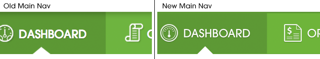
With our app being responsive to both small and large screens now, there was no way I could stick with the raster image icons I had been using before. My existing image sprite was an insane 2300px tall PNG that contained icons of one size with a few color variations. The thought of having to create and support new sizes of all of the icons and their color combos made me sad in my heart and that alone was enough to convince me to move to an icon font. That’s before mentioning that this will also make the icons infinitely scalable, insanely easy to style and will require fewer server requests, but I digress…
After some scouring, I decided to go with Symbolicons Line and Block from the fine folks at Symbolset. These beautifully designed sets came closest to our old raster icons, in terms of overall aesthetic and selection. They were super-easy to implement thanks to our recent Sass conversion and look gorgeous at any size, especially on retina displays. Check out this side-by-side before and after:
We didn’t stop at just the static icons, either. I converted all of our “loading” spinner animated gifs to be an icon font as well. Before, I had 11 different animated gifs of various sizes and colors of a chasing arrow preloader that were used in different contexts of the app, eating up server requests and becoming a nuisance to manage. To make the converted icon spin, I simply used CSS3 animation for the job. And what about browsers (like IE9) that don’t support CSS3 animations? They fallback to a static icon of an hour glass. Hello, progressive enhancement.
5. We stopped supporting IE8
While this didn’t really require any refactor work, we decided during this project that we were going to drop our support of Internet Explorer 8 for our application. While testing all of the enhancements we made both on the backend and the frontend, we discovered that IE8 just couldn’t keep up anymore. It’s been a thorn in our side for some time now, but this was the breaking point for us. During testing, it would crash randomly and when it would actually work, it was extremely sluggish. Thankfully, IE8 doesn’t have the market share with our users to make it worthwhile for us to support it, so we decided to say goodbye and send it packing with the release of the refactor.
A week before pushing everything to production, we sent an email out to all of our users to give them the heads up that they needed to upgrade their browser. We’ve received zero backlash about the decision, and are quite happy to be moving on to bigger and better things. Looks like we’re not the only ones doing it either.
So there you have it. Now it’s time to start building some new features and moving the rest of our legacy pages over to our new system. That means there’s still a lot of work to be done – but thanks to this refactor, things should be much faster, smoother and more fun to work on.
While it’s hard to wedge a project like this into any small dev team’s schedule, it’s seriously worth making it happen sooner than later.